The challenge was to create a label that reflected Kayla Dairy's advocacy of making quality milk affordable and accessible while standing out in a competitive retail market.
The Philippine dairy market is highly competitive, dominated by established local and international brands. Many consumers associate quality milk products with premium pricing, creating a gap for families seeking nutritious dairy products at an affordable cost.
Kayla Dairy was created with a clear mission:
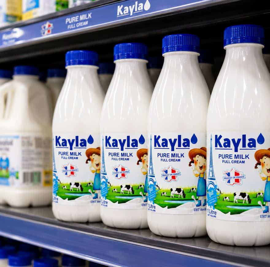
Providing fresh and authentic dairy products, and right now the star of the show is Kayla’s 1L box of full cream milk.
Strategy
The packaging design was developed around three key pillars:
1. Accessibility
The brand needed to feel approachable and family-oriented. Visual elements were chosen to communicate warmth, reliability, and everyday affordability.
2. Quality Perception
While positioned as an affordable option, the product still needed to convey quality and nutritional value. The design balanced simplicity with professional branding cues commonly found in trusted dairy products.
3. Shelf Impact
In a retail environment where consumers make quick purchasing decisions, strong visual hierarchy and clear product information were prioritized to improve recognition and visibility.
Result
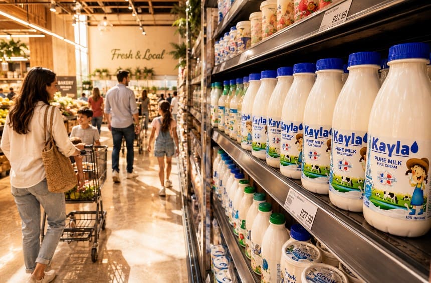
Today, Kayla Dairy products are distributed through major grocery retailers across the Philippines, increasing access to affordable dairy products for Filipino consumers.
This project demonstrates how thoughtful packaging design can support a larger business mission. By aligning branding with affordability, accessibility, and trust, Kayla Dairy was able to establish a presence in a competitive market while staying true to its goal of providing quality nutrition at an accessible price point.
For me, the project highlighted the importance of balancing commercial objectives with consumer needs—creating packaging that not only looks appealing but also communicates value, credibility, and purpose.